In this article
Most buyers first hear about a real estate project through an ad on Facebook, Google or Zalo, then tap through to a landing page. They decide within seconds whether to keep reading. A good landing page does not need a lot of text, but it has to answer the questions buyers are asking, in the order they ask them.
Here are the 8 sections VLand always includes when building a project landing page.
1. A first screen that says what the project is
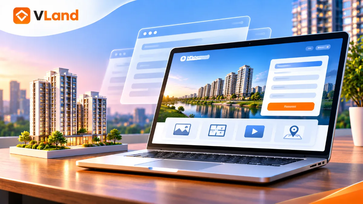
What visitors see before scrolling should answer three questions: what the project is called, where it is, and who it is for. A strong render, a short headline stating the main benefit and one call to action such as "Get the price list" are enough.
Avoid five-image sliders or long paragraphs here. Visitors from ads are usually scrolling on their phones and need to understand straight away.
2. Location and connections
In real estate, location is almost always the second question. Show a map and the travel time, in minutes rather than kilometres, to places people know: the city centre, schools, hospitals and main roads.
3. Project overview
A short table with the developer, scale, number of towers and units, product types, handover date and legal status. Buyers often screenshot this part to send to family, so keep it compact and easy to read on a phone.
4. Floor plans and unit types
Buyers want to know which unit fits their family. Group by unit type (1, 2 or 3 bedrooms), each with a floor plan, area and a one-line description. If possible, put a "Get the price for this unit" button next to each type so people can sign up while they are interested.
5. Amenities
Instead of listing dozens of amenities as text, pick the 6 to 8 strongest ones and show them with real photos or renders. People remember images better than lists.
6. Sales policy
Indicative prices, payment schedule, promotions and mortgage support. This is a major reason for visitors to leave their details, so you can reveal part of it and invite them to sign up for the full version.
7. A short form that appears more than once
The longer the form, the fewer people fill it in. Name and phone number are enough for a first contact. Place the form at the top, middle and bottom of the page, with call and Zalo buttons floating in the corner on mobile.
Just as important: leads must reach the sales team immediately. Sending them straight to Google Sheets and email, or to a CRM, avoids the situation where someone signs up in the evening and nobody calls until the next morning.
8. Load speed and tracking
Project images tend to be heavy. If the page loads slowly on 4G, visitors leave before they see the headline, and the money spent on that click is gone. Compress images, use modern formats such as WebP and only load images as visitors scroll to them.
Finally, set up tracking (Google Analytics, Facebook Pixel, Google Ads conversions) so you know which channel brings in real leads, not just page views.
In short
An effective project landing page answers buyers' questions, loads fast on mobile and makes it as easy as possible to leave contact details. If you are preparing a launch and need a page like this, get in touch with VLand for advice and a quote within 24 hours.